

STAR WARS: THE PHANTOM MENACE BOOK REDESIGN
THE DESIGN CHALLENGE
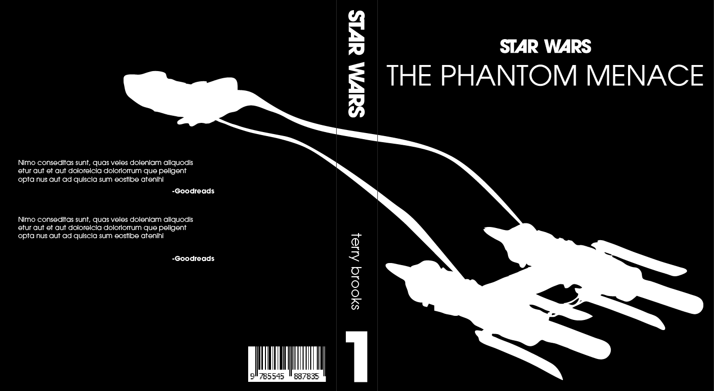
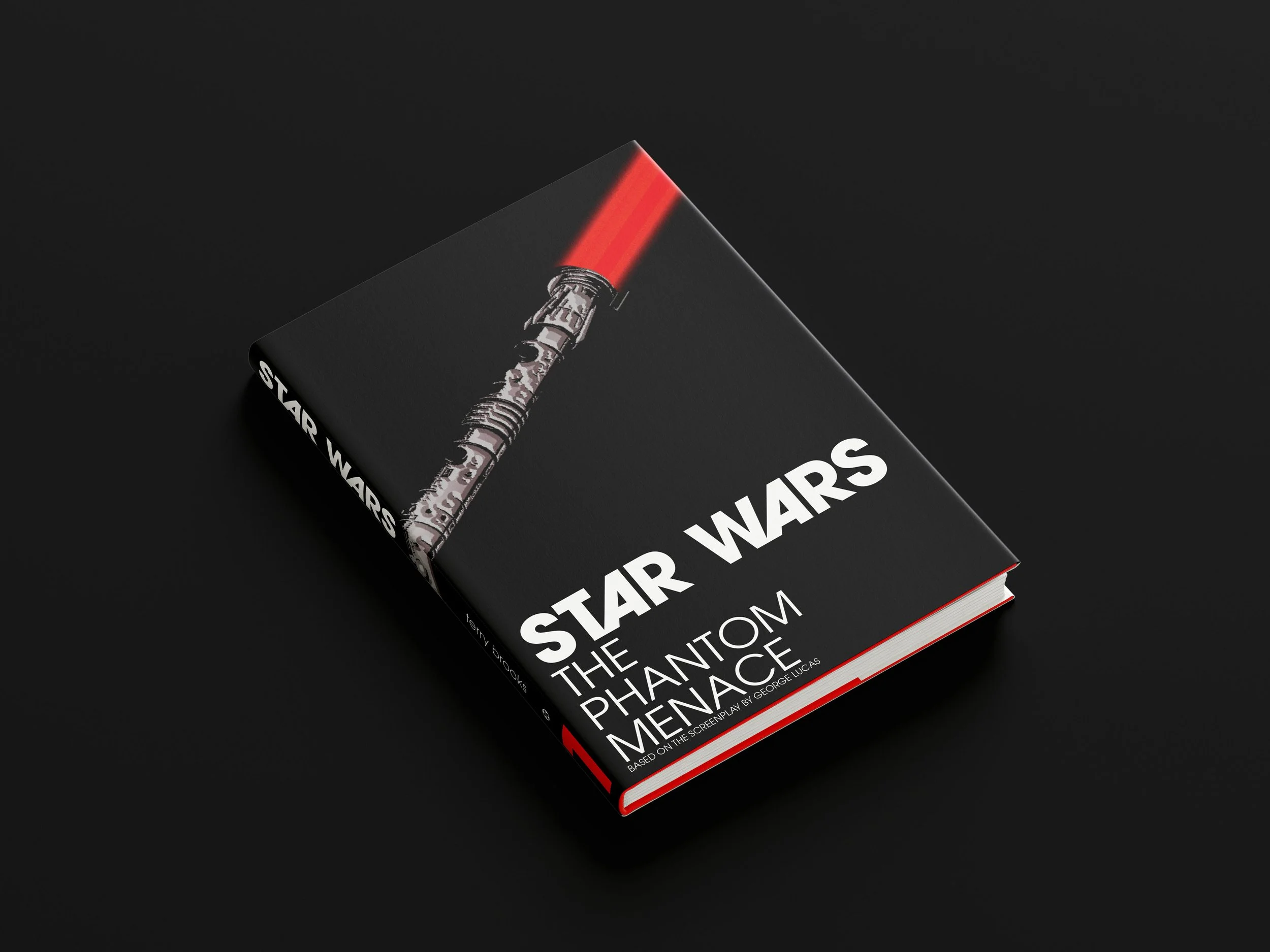
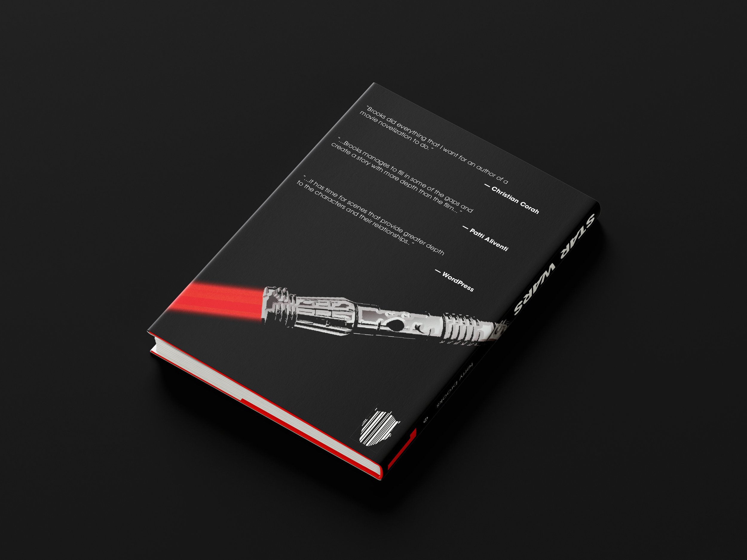
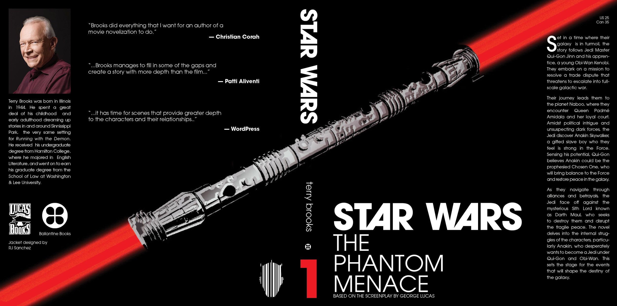
The challenge for this project was to create a book jacket based on a theme in the book. I chose Star Wars: The Phantom Menace, from my personal collection, as the focus of this project. There are so many themes in this book it was hard to pick one. For those of you who are Star Wars fans, you will see I used Darth Maul as the main focal point for this cover redesign.
RESEARCH & INSPIRATION


Before any designing took place, I searched for inspiration and works to refer to, including my personal copy of The Phantom Menace. I mainly looked for how the symbols and type interacted within the jackets, what worked for telling the story, and what didn’t.


THEME IDENTIFICATION & SKETCHING


After doing some research, I began to explore the main themes/symbols that were present in my book and could be used as the main focal point. Once I narrowed it down to a few options I began sketching out layout ideas for the jacket as a whole.
DIGITAL DRAFTS
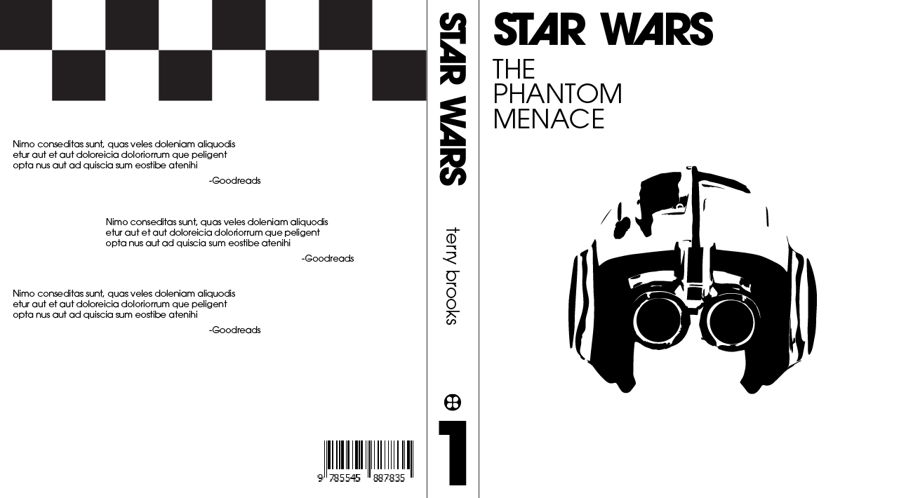
After selecting a few cover sketches I moved to creating digital versions. These were very bare bones and mostly the front and back cover. I explored different type layouts and hierarchy, using a typeface that I thought best spoke to the story.

TYPOGRAPHY & COLOR SELECTIONS


For the typeface I chose ITC Avant Garde Gothic, which was actually suggested by my professor. I felt the geometric sans serif perfectly represented the sci-fi setting of the novel. It also had enough styles work for the main title and body copy, keeping a consistent look and feel throughout. Glyphs were also used for the A’s in the main title.
FINAL MOCKUPS


PDF SPREAD
THE OUTCOME
Looking at the final piece I can say I am happy with how it turned out. I was excited about my book choice and knew I had some good stuff to work with. I learned a lot about layout and spacing on this project since it was my first time designing a book cover/jacket. Designing for the theme of the content was great practice and is something I want to do more of.